Monday, 25 February 2013

Styles and Methods: Part 2

One of my favourite printmaking processes is lino printing. Lino printing (sometimes known more broadly as relief printing) is a reductive method. I begin with a flat piece of linoleum, then use special tools to carve out certain areas. When I have finished carving, I use a roller to roll ink over the surface. The ink sits on the surface, but doesn't go into the grooves created by the carving. I then place paper on top, and either run it through a printing press or print by hand, pressing down on the back of the paper until all the ink has transferred. One of my favourite moments in printing is peeling back the paper and seeing the image for the first time...voila! 

The three images below are all created using lino, with varying outcomes.

The Wild Woods, 2011
Linocut (edition of 4)

In The Wild Woods the white areas have been carved out, and the remaining surface area inked up with black ink and printed.


Scarecrow in Field, 2011
Handcoloured linocut (uneditioned)

The above image was printed using black ink, then I added the colour using watercolour paint.
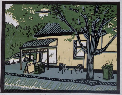
St Peters Bakehouse, 2011
Multiplate reduction linocut (edition of 4)

St Peters Bakehouse was a little more complicated to do, utilizing two separate lino blocks and four different colours. This method is called a reduction print, as I used the same block of lino to print the grey, beige and green. 

I started by carving out all the areas that would be white, then inked up the entire block and printed it in beige. I then took the same block and carved out everything that I wanted to keep beige, and printed the second layer in green. Carving out everything I wanted to keep green, I printed the third layer in grey. The fourth and final layer was printed in black using a second lino block (called the key block as it ties the whole image together).

This method can be tricky as essentially you are burning your bridges as you go. No coming back at a later date and re-printing the edition! When I use this method I always make sure I print more than I need in the edition, as it is also very easy to mis-register one of the layers and stuff the entire print up. Although some slippage can make the print look more lively, too much and you risk looking like you can't register at all!

Coincidentally, St Peters Bakehouse also serves the best coffee scrolls in town.


Saturday, 16 February 2013

Styles and Methods: Part 1

Over the years of developing my artistic style, I have tried many different techniques. Although not all were for me, I do like to work in a variety of media and styles. Some of my work tends to be serious, while some is more whimsical and illustrative. 

Dead Albatross, 2011
Monoprint and collagraph with chine collé
Irregular edition of 6

Dead Albatross was inspired by media reports detailing the ongoing problem of pollution in our oceans and its effect on bird and marine life. It was also influenced by photographer Chris Jordan's images of dead birds from his Midway series. This work portrays an albatross whose death was caused by ingesting plastic in polluted waters. 

In 2012 this work was selected for inclusion in the Waterhouse Natural History Exhibition (in Adelaide), winning Third Prize in the Youth Section. 

The methods I have used are a combination of monoprinting and a collagraph with chine collé. This probably sounds like gobbledygook to most, so let me explain! 

Monoprinting is fairly straightforward and basically just what it sounds like: in fact, most people as kids have probably done some kind of monoprinting in the form of butterfly paintings (painting on one side of a piece of paper, then folding it in half to duplicate, forming a symmetrical pattern). To create this piece I painted on a piece of cardboard the sandy background colour using intaglio inks. Placing a piece of damp paper on top, I ran both through a printing press to transfer the ink to my damp paper.

The formation of a collagraph begins with making a collage of sorts. Different textural materials ranging from string and netting to carborundum grit, feathers and cardboard are glued onto a piece of cardboard, forming the matrix. (The matrix is not the end product, merely the block from which repeated prints can be pulled). The matrix is inked up using intaglio ink and dabbers, so the ink is pushed into all the cracks of the various textures. I wipe back any excess ink, and once again take my damp paper (already coloured with my monoprint) and place it on top. Put through the press, the ink from the matrix transfers, forming the most prominent layer of this print (the bird).

But what about those coloured bits? They were created using a technique called chine collé, which is where little bits of very thin paper are glued on one side and placed on the matrix plate of the collagraph. When the damp paper is placed on top and everything run through the press, the thin paper is transferred, along with the ink from the collagraph. 


The Beginning of Memory

The following two small works were inspired by American experimental performance artist, composer and musician Laurie Anderson's piece The Beginning of Memory, from her 2010 album Homeland. 

The piece is set in a time before there was any earth or land, just air and birds circling everywhere. In the story one of the birds is a lark, and one day her father dies. The lark has a problem as there is nowhere to bury the body. Finally she finds a solution. She buries the body in the back of her own head. 

And that is the beginning of memory.

The Beginning of Memory, 2011
Linocut

Flying Birds Everywhere, 2011
Multiplate etching and aquatint on copper


Monday, 11 February 2013

Old Works

To Freedom, 2010
Edition no. 2/4, linocut
When I studied printmaking at Adelaide College of the Arts, students were often given themes to work with while learning new techniques. The theme for this piece was "flight", and I chose to respond by depicting a boat of refugees fleeing to Australia. 


Home, 2010
Soft ground etching (image on right is also hand coloured)

These images were my first attempt at using soft ground for etching. Materials such as orange bag netting and string were used to create the textures seen in the ground.